.webp)
About the project
This project focuses on designing a playful label for a kombucha brand. The design combines hand-drawn typography, minimalist illustrations, and soft color palettes to create a fresh and distinctive look.
Project goal
The goal was to create a label that captures the natural, vibrant, and friendly personality of the product while standing out on the shelf. The visual identity was designed to be memorable, modern, and instantly recognizable.
Sketch Exploration
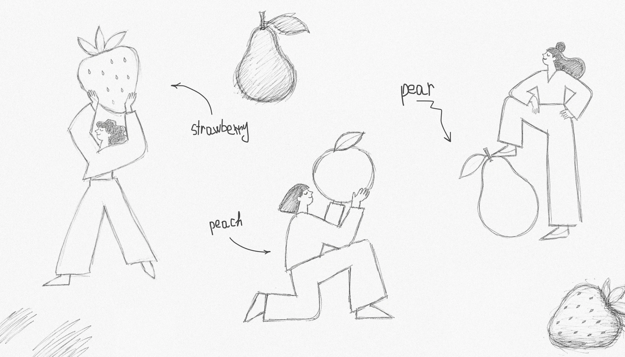
Quick hand-drawn sketches were created to explore composition, character poses, and the interaction between people and fruits before moving to the final illustrations.
Design Solution
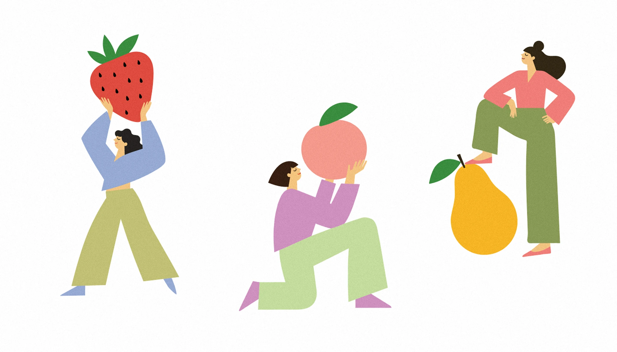
The final label design combines expressive hand-drawn typography, playful illustrations, and a clean layout to create a strong shelf presence. A color-coded flavor system and fruit-inspired characters make each variant instantly recognizable while keeping the product line cohesive and memorable.

.webp)
.webp)
.webp)
.webp)
.webp)